In the old days, wind turbines used to look like this. These turbines in the Tehachapi Pass windfarm in California were only built in the 80s.
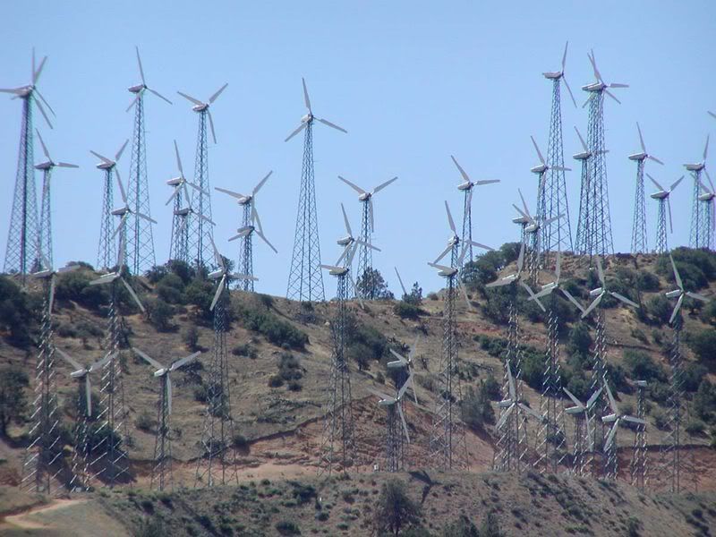
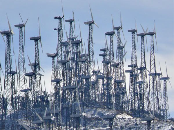
Even those who don't like the look of modern wind turbines would have to say that what we have now is a vast improvement on the earlier versions.
-
So it is interesting to read that moves are being made to change another design anachronism, the pylons that carry overhead cables. The RIBA is launching a competition for alternative designs, following the example of Iceland.
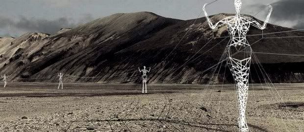
I don't think it's quite fair to say that Iceland uses these anthropomorphic pylons, they are a conceptual design. And, as we can see from the number of stay cables required to hold the pylons up, it's not a particularly well-conceived solution from a structural point of view. But they are a lot of fun and I particularly like this image:
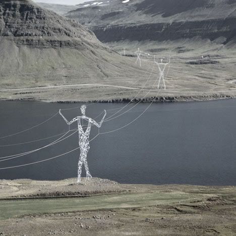
Another weird but wonderful entry was from Arphenotype:
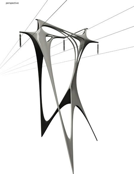
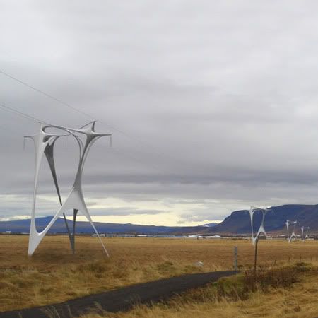
I'm sure the RIBA competition will produce some equally idiosyncratic designs. But for me, the sort of alternative design that would work best is one of elegant simplicity.
-
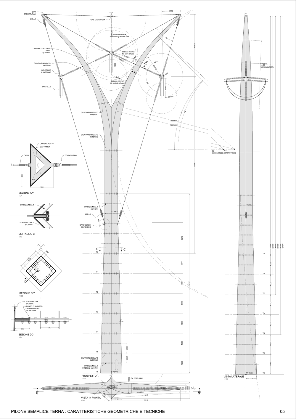
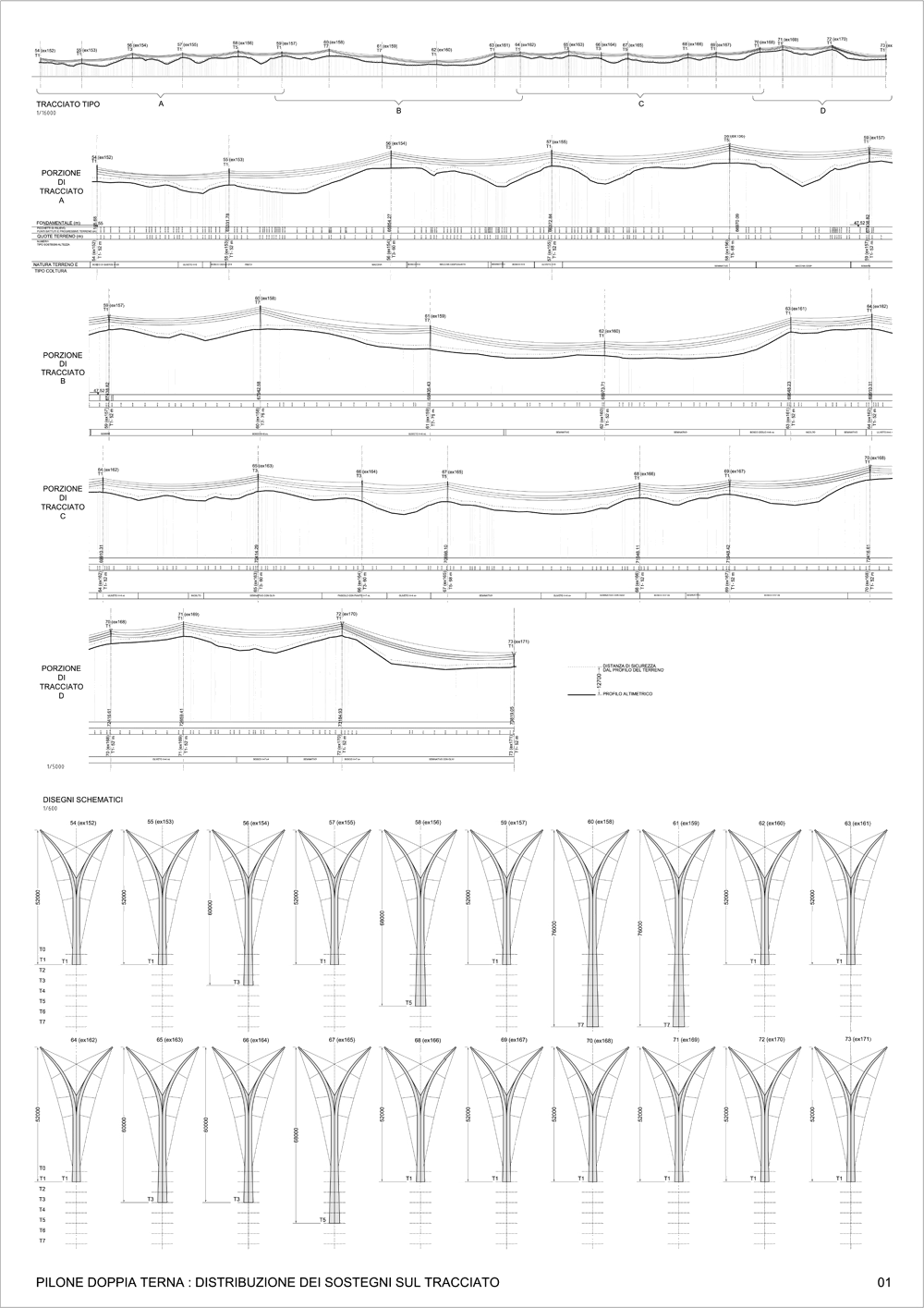
This design called Dancing with Nature by Hugh Dutton Associés for the Italian energy company Terna fits that description perfectly, and explains the title of this post.
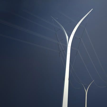
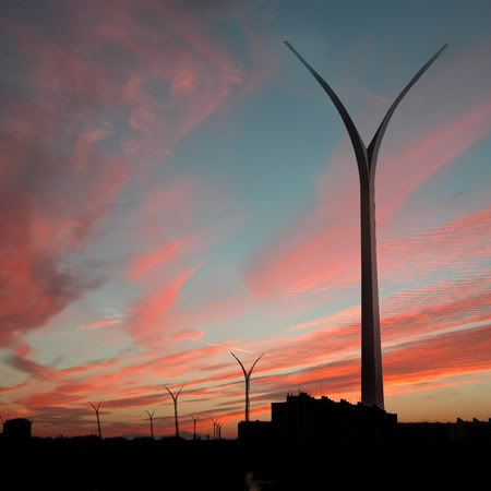
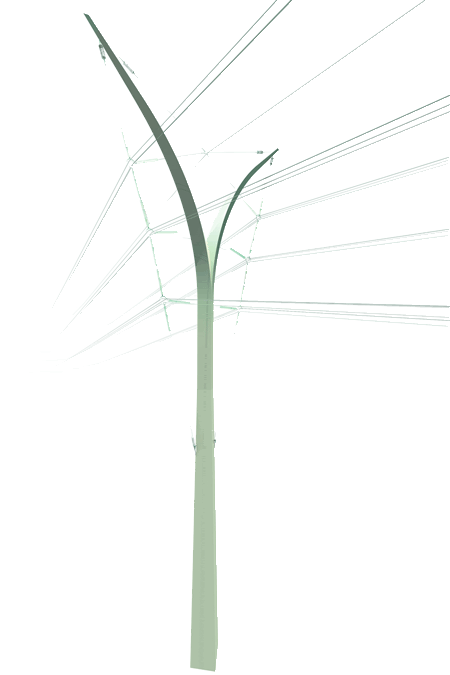
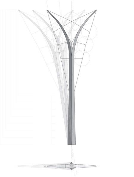
Even the technical detail is fascinating ... well, at least to me. Clicking the images will open a larger version.
Whatever arguments there might be over where to put power lines and whether or not they should be underground, we would do well to ensure that all future pylons are more like this, rather than keep putting up latticework pylons that have hardly changed since the 20s. As with the design of wind turbines, it's time for us to insist on pylons that might grace rather than spoil our landscape.


3 comments:
Excellent idea. Some of these designs are fantastic (though I have no idea how practical).
moncler outlet
yeezy 500 blush
longchamp
supreme hoodie
yeezy
yeezy boost 350
stone island
kevin durant shoes
goyard bags
jordan shoes
replica bags new york replica bags and shoes replica bags joy
Post a Comment